
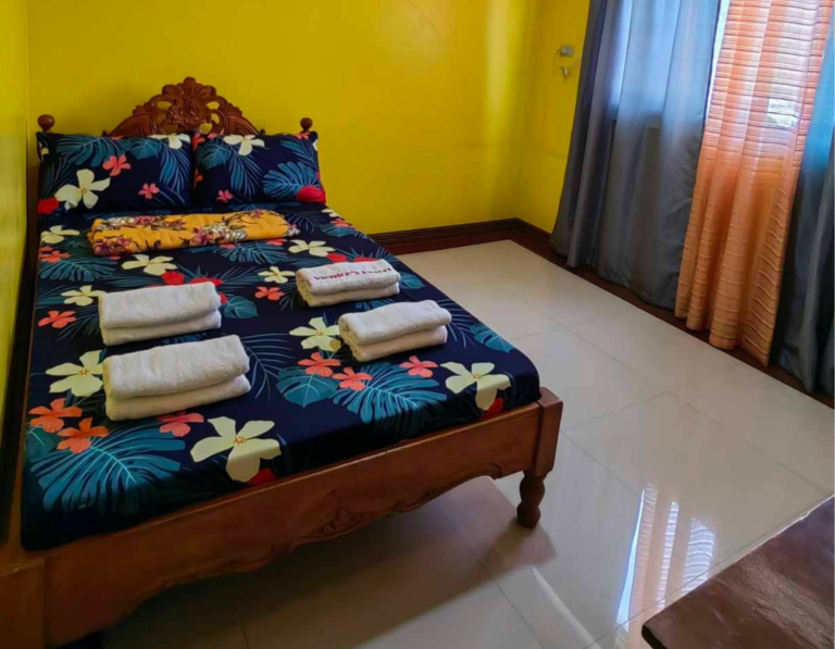
Couple Room (4 Pax)
A cozy and comfortable room perfect for couples or solo travelers.
(52.5K Reviews)
2-4 Guests
Private Bathroom
Free Parking
Air Conditioned
Smart TV
Free WiFi
Price starts at
₱2,900
/* ==========================================================================
1. GLOBAL & PACKAGED CONTAINER SETTINGS
========================================================================== */
.vienices-custom-form {
background: #ffffff !important;
border: 1px solid #e2e8f0 !important;
border-radius: 12px !important;
padding: 30px !important;
width: 100% !important;
max-width: 100% !important;
box-shadow: 0 4px 20px rgba(0, 0, 0, 0.05) !important;
font-family: -apple-system, BlinkMacSystemFont, "Segoe UI", Roboto, Arial, sans-serif !important;
box-sizing: border-box !important;
margin: 0 auto !important;
display: flex !important;
flex-direction: column !important;
height: 100% !important;
min-height: 580px !important;
}
/* ==========================================================================
2. CALENDAR COMPONENT SPECIFIC STYLES (Global Definitions)
========================================================================== */
.vienices-custom-form .mphb-calendar-wrapper,
.vienices-custom-form .mphb-calendar,
.vienices-custom-form .datepick-inline,
.vienices-custom-form .datepick-month-outer,
.vienices-custom-form .datepick-month-row,
.vienices-custom-form .datepick-month,
.vienices-custom-form table.datepick-month {
background: transparent !important;
border: none !important;
padding: 0 !important;
box-shadow: none !important;
box-sizing: border-box !important;
float: none !important;
}
/* Headers */
.vienices-custom-form .mphb-calendar::before {
content: "Check Availability" !important;
display: block !important;
font-size: 20px !important;
font-weight: 800 !important;
color: #0c2340 !important;
margin-bottom: 4px !important;
text-align: center !important;
}
.vienices-custom-form .mphb-calendar::after {
content: "Select your dates to see availability and prices." !important;
display: block !important;
font-size: 12.5px !important;
color: #64748b !important;
margin-bottom: 10px !important;
text-align: center !important;
}
/* Header Navigation Links */
.vienices-custom-form .datepick-nav {
display: flex !important;
justify-content: space-between !important;
align-items: center !important;
width: 100% !important;
margin-bottom: 15px !important;
float: none !important;
}
.vienices-custom-form .datepick-month-header,
.vienices-custom-form .mphb-calendar-header {
background: transparent !important;
color: #0c2340 !important;
font-weight: 700 !important;
font-size: 15px !important;
padding: 5px 0 !important;
display: flex !important;
justify-content: center !important;
align-items: center !important;
gap: 8px !important;
width: 100% !important;
border: none !important;
}
/* Dropdown styling */
.vienices-custom-form .datepick-month-header select {
padding: 6px !important;
height: auto !important;
min-height: unset !important;
border: 1px solid #cbd5e1 !important;
border-radius: 6px !important;
font-size: 13px !important;
}
.vienices-custom-form .datepick-cmd-today {
display: none !important;
}
.vienices-custom-form .datepick-cmd-prev,
.vienices-custom-form .datepick-cmd-next {
color: #64748b !important;
text-decoration: none !important;
font-size: 14px !important;
font-weight: bold !important;
padding: 5px 10px !important;
white-space: nowrap !important;
}
.vienices-custom-form .datepick-cmd-prev:hover,
.vienices-custom-form .datepick-cmd-next:hover {
color: #005a36 !important;
}
.vienices-custom-form table.datepick-month td em,
.vienices-custom-form table.datepick-month td .mphb-price {
display: none !important;
}
/* Calendar Day Core States */
.vienices-custom-form table.datepick-month td.mphb-date-available a,
.vienices-custom-form table.datepick-month td.datepick-available a,
.vienices-custom-form table.datepick-month td[class*="available"] a {
background-color: #e6f4ea !important;
color: #137333 !important;
}
.vienices-custom-form table.datepick-month td.datepick-selected a,
.vienices-custom-form table.datepick-month td.mphb-date-selected a,
.vienices-custom-form table.datepick-month td.mphb-booked-date-check-out a {
background-color: #005a36 !important;
color: #ffffff !important;
}
.vienices-custom-form table.datepick-month td.datepick-unselectable span,
.vienices-custom-form table.datepick-month td.mphb-date-not-available span,
.vienices-custom-form table.datepick-month td.mphb-date-past span {
background-color: #f1f5f9 !important;
color: #94a3b8 !important;
opacity: 0.7 !important;
}
/* ==========================================================================
3. BOOKING FORM COMPONENT SPECIFIC STYLES (Right Side Widget)
========================================================================== */
.vienices-custom-form:not(.mphb-calendar-wrapper) form::before,
.vienices-custom-form form::before {
content: "Reserve This Room" !important;
display: block !important;
font-size: 20px !important;
font-weight: 800 !important;
color: #0c2340 !important;
margin-bottom: 4px !important;
grid-column: span 2 !important;
}
.vienices-custom-form:not(.mphb-calendar-wrapper) form::after,
.vienices-custom-form form::after {
content: "Enter your details to proceed with your reservation." !important;
display: block !important;
font-size: 12.5px !important;
color: #64748b !important;
margin-bottom: 15px !important;
grid-column: span 2 !important;
order: -1 !important;
}
.vienices-custom-form form,
.vienices-custom-form .mphb-booking-form-fields {
display: grid !important;
grid-template-columns: 1fr 1fr !important;
gap: 15px !important;
height: 100% !important;
}
.vienices-custom-form p,
.vienices-custom-form .mphb-required-field {
margin: 0 !important;
display: flex !important;
flex-direction: column !important;
grid-column: span 1;
}
.vienices-custom-form p:nth-child(3),
.vienices-custom-form p:nth-child(4),
.vienices-custom-form .mphb-errors-wrapper,
.vienices-custom-form .mphb-reserve-btn-wrapper,
.vienices-custom-form .mphb-price-breakdown {
grid-column: span 2 !important;
}
.vienices-custom-form label {
font-size: 12px !important;
font-weight: 600 !important;
color: #1e293b !important;
margin-bottom: 6px !important;
text-align: left !important;
}
.vienices-custom-form label abbr {
text-decoration: none !important;
color: #dc2626 !important;
}
.vienices-custom-form input[type="text"],
.vienices-custom-form input[type="date"],
.vienices-custom-form select {
width: 100% !important;
background: #ffffff !important;
border: 1px solid #cbd5e1 !important;
border-radius: 6px !important;
padding: 10px 12px !important;
font-size: 13px !important;
color: #334155 !important;
outline: none !important;
transition: border-color 0.2s ease !important;
box-sizing: border-box !important;
min-height: 42px !important;
}
.vienices-custom-form input:focus,
.vienices-custom-form select:focus {
border-color: #005a36 !important;
box-shadow: 0 0 0 2px rgba(0, 90, 54, 0.1) !important;
}
.vienices-custom-form .mphb-price-breakdown,
.vienices-custom-form .total-price-preview-block {
grid-column: span 2 !important;
background-color: #f1f5f9 !important;
border-radius: 6px !important;
padding: 15px !important;
margin-top: 10px !important;
margin-bottom: 5px !important;
font-size: 13px !important;
font-weight: 600 !important;
color: #005a36 !important;
}
.vienices-custom-form button,
.vienices-custom-form input[type="submit"],
.vienices-custom-form .mphb-book-button {
grid-column: span 2 !important;
width: 100% !important;
background-color: #005a36 !important;
color: #ffffff !important;
font-size: 14px !important;
font-weight: 700 !important;
text-transform: uppercase !important;
letter-spacing: 0.5px !important;
padding: 14px !important;
border: none !important;
border-radius: 6px !important;
cursor: pointer !important;
display: flex !important;
align-items: center !important;
justify-content: center !important;
gap: 8px !important;
margin-top: auto !important;
transition: background-color 0.2s ease !important;
}
.vienices-custom-form button:hover,
.vienices-custom-form input[type="submit"]:hover,
.vienices-custom-form .mphb-book-button:hover {
background-color: #004428 !important;
}
.vienices-custom-form button::before,
.vienices-custom-form input[type="submit"]::before {
content: "🔒" !important;
font-size: 14px !important;
}
.vienices-custom-form button::after,
.vienices-custom-form input[type="submit"]::after {
content: "🔒" !important;
font-size: 14px !important;
}
.vienices-custom-form .mphb-reserve-btn-wrapper::after,
.vienices-custom-form .mphb-submit-button-wrapper::after,
.vienices-custom-form form .vienices-footnote-notice {
content: "You won't be charged yet" !important;
display: block !important;
width: 100% !important;
text-align: center !important;
font-size: 11px !important;
color: #64748b !important;
margin-top: 12px !important;
}
/* ==========================================================================
4. DESKTOP SPECIFIC FIXES - WIDE SCREEN CENTER BALANCING (min-width: 1025px)
========================================================================== */
@media screen and (min-width: 1025px) {
.vienices-booking-wrapper {
display: flex !important;
flex-direction: row !important;
justify-content: center !important;
align-items: stretch !important;
width: 100% !important;
max-width: 1200px !important;
margin: 0 auto !important;
gap: 30px !important;
}
.vienices-booking-wrapper > .elementor-element,
.vienices-booking-wrapper > div {
width: 50% !important;
max-width: 550px !important;
flex: 1 !important;
display: flex !important;
}
/* Force the parent calendar container card to center its content alignment */
.vienices-custom-form {
align-items: center !important;
}
.vienices-custom-form .mphb-calendar-wrapper,
.vienices-custom-form .mphb-calendar {
text-align: center !important;
width: 100% !important;
display: flex !important;
flex-direction: column !important;
align-items: center !important;
}
/* Center alignment for internal components matching image_fd73bf.png */
.vienices-custom-form .datepick-inline {
margin: 20px auto 0 auto !important;
width: 100% !important;
max-width: 440px !important;
}
.vienices-custom-form table.datepick-month {
display: block !important;
width: 100% !important;
}
.vienices-custom-form table.datepick-month thead,
.vienices-custom-form table.datepick-month tbody {
display: block !important;
width: 100% !important;
}
.vienices-custom-form table.datepick-month tr {
display: grid !important;
grid-template-columns: repeat(7, 1fr) !important;
gap: 8px !important;
width: 100% !important;
margin-bottom: 8px !important;
}
.vienices-custom-form table.datepick-month th,
.vienices-custom-form table.datepick-month td {
width: 100% !important;
max-width: 100% !important;
display: block !important;
}
.vienices-custom-form table.datepick-month th {
font-size: 14px !important;
font-weight: 700 !important;
padding: 5px 0 !important;
}
.vienices-custom-form table.datepick-month td a,
.vienices-custom-form table.datepick-month td span {
width: 100% !important;
height: auto !important;
aspect-ratio: 1 / 1 !important;
min-height: 54px !important;
font-size: 16px !important;
border-radius: 8px !important;
}
.vienices-custom-form .datepick-month-header select {
width: 130px !important;
font-size: 14px !important;
padding: 8px !important;
}
}
/* ==========================================================================
5. TABLET SPECIFIC STYLES (768px to 1024px)
========================================================================== */
@media screen and (max-width: 1024px) and (min-width: 768px) {
.vienices-booking-wrapper {
display: flex !important;
flex-direction: row !important;
justify-content: space-between !important;
align-items: stretch !important;
width: 100% !important;
gap: 20px !important;
}
.vienices-booking-wrapper > .elementor-element,
.vienices-booking-wrapper > div {
width: 48% !important;
max-width: 48% !important;
flex-basis: 48% !important;
display: flex !important;
}
.vienices-custom-form {
padding: 20px !important;
}
.vienices-custom-form .mphb-calendar-wrapper,
.vienices-custom-form .mphb-calendar,
.vienices-custom-form .datepick-inline,
.vienices-custom-form .datepick-month-outer,
.vienices-custom-form .datepick-month {
width: 100% !important;
}
.vienices-custom-form table.datepick-month thead,
.vienices-custom-form table.datepick-month tbody {
display: block !important;
width: 100% !important;
}
.vienices-custom-form table.datepick-month tr {
display: flex !important;
width: 100% !important;
justify-content: space-between !important;
margin-bottom: 6px !important;
}
.vienices-custom-form table.datepick-month th,
.vienices-custom-form table.datepick-month td {
flex: 1 !important;
width: 0 !important;
display: block !important;
}
.vienices-custom-form table.datepick-month td a,
.vienices-custom-form table.datepick-month td span {
width: 100% !important;
min-height: 40px !important;
font-size: 11.5px !important;
display: flex !important;
}
.vienices-custom-form .datepick-month-header select {
flex: 1 !important;
}
}
/* ==========================================================================
6. RESPONSIVE BREAKPOINTS (MOBILE ONLY ARCHITECTURE)
========================================================================== */
@media screen and (max-width: 767px) {
.vienices-booking-wrapper,
.vienices-booking-wrapper .elementor-container,
.vienices-booking-wrapper .elementor-row {
display: flex !important;
flex-direction: column !important;
width: 100% !important;
gap: 20px !important;
}
.vienices-booking-wrapper > .elementor-element,
.vienices-booking-wrapper > div,
.vienices-booking-wrapper .elementor-column,
.vienices-booking-wrapper .elementor-top-column,
.vienices-booking-wrapper .elementor-col-50 {
width: 100% !important;
max-width: 100% !important;
flex-basis: 100% !important;
display: block !important;
margin: 0 0 10px 0 !important;
}
.vienices-custom-form {
width: 100% !important;
max-width: 100% !important;
min-height: auto !important;
padding: 22px 16px !important;
}
.vienices-custom-form .mphb-calendar::before {
font-size: 18px !important;
white-space: normal !important;
word-wrap: break-word !important;
display: block !important;
}
.vienices-custom-form .datepick-nav {
display: flex !important;
flex-direction: row !important;
justify-content: space-between !important;
align-items: center !important;
width: 100% !important;
gap: 10px !important;
}
.vienices-custom-form .datepick-cmd-prev,
.vienices-custom-form .datepick-cmd-next {
display: inline-block !important;
white-space: nowrap !important;
font-size: 14px !important;
padding: 4px 8px !important;
}
.vienices-custom-form form,
.vienices-custom-form .mphb-booking-form-fields {
display: flex !important;
flex-direction: column !important;
gap: 14px !important;
width: 100% !important;
}
.vienices-custom-form p,
.vienices-custom-form .mphb-required-field,
.vienices-custom-form form::before,
.vienices-custom-form form::after {
width: 100% !important;
display: flex !important;
flex-direction: column !important;
}
.vienices-custom-form .mphb-calendar-wrapper,
.vienices-custom-form .mphb-calendar,
.vienices-custom-form .datepick-inline,
.vienices-custom-form .datepick-month-outer,
.vienices-custom-form .datepick-month {
width: 100% !important;
max-width: 100% !important;
}
.vienices-custom-form table.datepick-month thead,
.vienices-custom-form table.datepick-month tbody {
display: block !important;
width: 100% !important;
}
.vienices-custom-form table.datepick-month tr {
display: flex !important;
width: 100% !important;
justify-content: space-between !important;
margin-bottom: 6px !important;
}
.vienices-custom-form table.datepick-month th,
.vienices-custom-form table.datepick-month td {
flex: 1 !important;
width: 0 !important;
display: block !important;
}
.vienices-custom-form table.datepick-month td a,
.vienices-custom-form table.datepick-month td span {
width: 100% !important;
min-height: 42px !important;
font-size: 13px !important;
display: flex !important;
}
}